Thursday, June 12, 2008

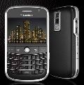
Samsung Blackjack 2 Review

I never owned a Windows Mobile phone before. I got this phone for several reasons…

- It had a qwerty keyboard

- It had good battery life

- It had double the RAM of the i607 Blackjack

- It did MP3s

- Had a 2 megapixel camera

- The jog wheel looked interesting to use

- I wanted to try Windows Mobile on a day-to-day basis

- Being a Rogers branded phone, I figured it would work with the WAP, and all other carrier-premium features that I sacrificed by having an aftermarket phone

They sold it at Rogers without a contract for over $500.00 without taxes – so I bought it for $300 off a Petro Canada executive who went Blackberry (just as I went non-Blackberry – ironically the transition in my case happened same-day).

I liked it right away. It took the 2GB microSD card from my 8320, so my music showed up right away, in an interface that I was familiar with (my documents, etc.) in the Windows Mobile. I found the jogwheel to be a pain to use right away, so I used it as a d-pad only (the dual functionality I really liked. If only the Curve had that!)
Something that turned me off instantly was the fact that I couldn’t use my own earbuds. Samsung has its own proprietary jack, which could be used for power, data, or audio. The quality on them was awful, and they were terribly designed. One ear plug was shorter than the other to bring the microphone closer to my face – but the cord kept bunching up. I instantly decided “forget the music – this thing will stick you out until the new iPhone comes out”. This was before I found out about the fact that the iPhone requires a new contract agreement. More on that in a moment.

So no music. This blows. It was a principal reason for me to get this phone over the curve. And the Curve had wifi! This is another feature this was missing. I thought to myself that I wouldn’t really need it. Boy, was I wrong. I now have to use my computer for all emails, youtube, facebook, eBay, and what not. This caused me to really loathe using it.

Then, I decided to try playing with the camera a little more. You know how on some cameras and cell phones (ahem… n80 with STRONG emphasis), after you press the button, it takes a second or two to actually capture the image? That’s exactly what this thing does! We were at Montana’s one night, and something we drew on the table (yes… we’re low class and impatient like that. Lol.) I decided to take a picture of. I turned on the camera, and took a shot of it, and then moved it away less than a second after clicking the button. On a decent phone, or camera, it would have stayed as I had seen it, unless it was a moving object. Apparently, this phone suffers from lens retardation, and made a stationary table a moving object. Everybody asking how it came out, they see a blur of kraft paper and crayons, with what appeared to be a salad bowl at the end of it.

We all were puzzled. What was this? Where on earth did it come from? Analyzing what made up the smear that appeared on my screen, I quickly realized it was the drawing. It wasn’t an experience I was unfamiliar with, so I just held it in place the next time. It may seem miniscule, but in the long term, will make a big difference.

On the bright side of the camera, though, check out me with the giant Blackberry in Eglinton subway station. RIM’s crass form of promotion. I think they’re shaking in their shoes from Apple’s announcement of the Microsoft Exchange in email. They’re truly competing, and the word about RIM needs to get out there to save their hides. Anyway; won’t go into detail on that. But here’s the shot:


(Yes, that's the Blackjack 2 in my left hand) Why they didn’t use the Bold, I’ll NEVER know. As you can see in the picture, they have SURETYPE boards, and not qwerty boards, yet the form factor still proportionately resembles the curve. Coincidence? Bad/rushed modeling in haste of getting the word out there? I’ll go with the latter.

Another feature I liked about it was how at the bottom, there is an array of buttons for common tasks. They were browser, media, silent, camera, and messages. Very similar to the e61i’s panel of buttons, and was a feature I really liked, so that you didn’t have to go into the menu to access any functions, and they were all available at the touch of a hard key. What this did lack in comparison to the e61i, however, was a customizable key for your own application. Keep in mind, there are 5 one touch keys here as opposed to the e61i’s four, but I’d still like to have one of them to be custom.

The most useful one of them all, I found to be the silent/normal profile toggle. Phones such as the n91, the Treo 680, and the iPhone (just to name a few) had hard profile switch buttons, which I found to be very useful, as I have a tendency to leave my cell phone profile on very, very loud, and is often left there at the right times, usually because of laziness to change the profile. Then I assume nobody will call during that time. Boom. Everybody jumps when it rings because it’s so loud, and I have the embarrassment of having to pick up the phone at an unacceptable time.

On hand camera and messages were handy as well. One thing interesting that I noticed about the camera button was that if you held it down for a few seconds, it would zoom in on the screen you’re at so you can have a closer look. Talk about full-fledged Windows. This is the closest to a computer-like OS I’ve seen on a phone yet, with respect to its depth in features.

At the home screen, there is a dock on the bottom, which is similar to the active standby on the Nokia phones. It is a wide bar that shows only one option at a time, and you can scroll through with either the jog wheel or the up and down keys. It provides me with the following, in top to bottom order of appearance:

- Media (which allows me to pause my song by pressing the select button, or change the song by going left and right. If there is no song active, it will take you to your library)

- Messages/Email (toggle by hitting the left or right keys. Tells you how many new messages you have in each respective inbox, and selecting the inbox allows you to view its content, including the new messages)

- Missed calls

- Appointments

- My Documents/Storage card

- Last two most recent applications used (so if I was to open up calculator, then play a game of bubble breaker, and then exit, and realize I need to use the calculator again, I can just go to this option, and see that the calculator is 2nd on that list)

Another drawback was how hard it was to type with the keyboard. It’s somewhat split down the middle, making the keys T, Y, G, H, V and B rather difficult to hit, as they are the keys right at the split in the keyboard. I also found the keys to be smaller than your average keyboard (blame it on the small form factor), are harder to hit, and are also much less responsive, in the sense that if I start typing quickly, words will start to appear somewhat jumbled, as one of the keystrokes got “lost” in the process of typing.

Other positive features include an easy keypad lock mode, a “home” key that allows you to go to the home screen, and hit the “back” key to go right back to what you were doing, very loud volume, and the phone has an offline mode so you don’t have to fully turn it off at night!

Overall, I’d give this phone a 4/5. I think that may be a little generous, but there is very little wrong with the phone, and a whole lot is right. What was there and what wasn’t there, there was an improper balance of, hence the fact that it’s 20% off of perfect.

Wired: Windows mobile is easy to use. Dock on the main screen allows you to navigate applications with ease. So does the array of buttons at the bottom, covering browser, media, silent/normal profile toggle, camera, and messages/email functions. Sleek, sexy, lightweight design. Good, long lasting battery on it. Camera had Photo Booth-like functions, such as multi-photo shoot, and image filters such as negative, sepia, and black and white.

Tired: Not easy to type on, no wifi, no flash for the camera, media is a joke. Camera – I’m not even going to start with its slow capturing lens. Jog wheel is probably the worst medium of navigation next to the pearl on the RIM phones. Can’t use your own earbuds – Samsung proprietary headphones only. And they suck. Also, hefty price tag of CAD $449.99 plus 13% taxes certainly not worth it.

Bottom line: If you really like windows mobile, and have a data plan, and don’t do much multimedia, this is a good, solid blackberry alternative. It’s basically the sexier version of the blackberry curve 8300 (i.e. no wifi, or gps). Like I said about the curve 8320, don’t get it unless you have a data plan. I’m going to say the same about this phone. It does hold one advantage over the curve, though, and that’s 3G.

Next steps: Can’t really say anything. I’d recommend WiFi, no doubt (even GPS?), as well as a 3.5mm port for earbuds. I know I say this about every phone – but it has to be said. The lack of compatibility just kills a phone, as we all have our own earbuds that we’re used to using – and don’t want to switch over to. Sure, I’m using Apple’s iPhone earbuds as opposed to my beloved JVC Gumy’s. But the iPhones earbuds I find to be higher quality, and they have the microphone/play/pause/skip song button built in as well. The final feature I’d recommend is a broader form factor to support a more physically usable keyboard.

Tuesday, June 10, 2008

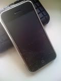
iPhone 3G - my take, as well as a few unanswered questions

Much anticipated with intense excitement, it's finally here. In 8gb and 16gb models. With no chrome on the back, a flush headphone port to the rest of the body, and of course 3G and GPS.

Well, let's start out with aesthetics. The iPhone hasn't changed much physically - same size (marginally wider and thicker), same shape, with the chrome around the edge, a home button, and what have you. The main differences are that there is no chrome on the back - the entire rear part is one solid colour, and that they come in different colours. The 8gb only comes in black, and the 16gb comes in either black or white. Somewhat like the 2nd generation ipod nanos, where the lower capacity ones came in only one colour, and they get you to spend more money, should you want a different coloured one.


What I want to know is - who the heck is John Appleseed?


If you ask me, they should have either offered a more exciting colour for the back (product red? I'd buy that), or an array of colours. If anything, the front's colour should correspond with the back's. I think the white edition is a mistake.

In wireless communications; the 3G will make a big difference for web browsers, photo uploaders, VoIP talkers, and the likes. Also, Bluetooth 2.0, fully expandable, so it's not just for headset support (will get a wireless keyboard for mine. I prefer to type on a hard keyboard over a soft one by a mile. Part of the reason I got rid of my original iphone)

Also, battery life is improved by adding 2 hours of talk time, giving us 10 hours (that's my main killer of battery life - another incentive to get it, particularly compared to the 7 hours that the e61i gave me), as well as 300 hours (12.5 days) of standby time. That's 50 hours more than the original iphone. I'm seeing all the original iphone flaws instantly go away!

Still lacks customizable ringtones. But hey, I'm getting an iTunes account, so I can just use one of my purchased songs as a ringtone. So I'm not 100% complaining - but they could still do better (or at least provide a richer list of ringtones. I mean, for crying out loud, Apple, you own the largest music store in the world - provide us with a few freebie ringtones? And not the nondescript "Alert" and "Blues riff" tones?)

Photography - still the same deal at 2 megapixels for the camera. Nothing is mentioned about the video recording, but it still doesn't have flash. Which I think is a big mistake. One would think that the addition of 3G would inspire them to add some 3G features such as video calling? Not to mention that a user-facing camera would bring on the use of photobooth software, which is pretty much the main reason people buy Mac computers! Why not have it on the go? How awesome of a commercial would that be? To take pictures of you and your friends in the pop art/fisheye/light tunnel filters. You could even apply that to the regular camera to take some really cool pictures with. I mean, they're using computer-caliber software - they might as well add some comparable features.

Something else I noticed was included in the package; a SIM ejector tool. "YES!" I said with great vengeance towards my past experiences with the iPhone SIM card. I remember at eComm 2008 in March, when James Body was unlocking my iPhone for me, he had to take out a paperclip from his bag. I mean seriously, Apple could either design it a little better so we don't need a tool to remove the SIM, or provide us with a SIM remover designed to do what several iPhone users struggled to do. Sure, I saw a few of them on eBay, but it should be included nonetheless. I also could have sworn I saw a syringe-style one once, for popping the tray out. What caused Apple to design it that way, I'll NEVER know.

Only thing I think that should have been different about their production, is making different models for consumer diversity (i.e. low budget consumers, high end executives, etc.). If you ask me, it would sell a lot better that way, just like a Macbook vs Macbook pro kind of relationship. The addition of Microsoft Exchange is a meager attempt at executive compatability, and they could have done much, much better with a model designed for email typing.

Also, I just LOVE how Apple tried to beat the installer application by having their own application store. Just comes to show you how much, for better or for worse, hackers have helped our technology world. They should have changed the wording, though, as several applications are free. I don't think I'll be jailbreaking my iPhone, should I be getting one of these, as that's what is currently messing up my brother's iPod Touch, so getting everything directly from Apple (be it a free application, or a $2.99 one) I'll have the peace of mind of legitimacy, and safety, as well as the self-fulfillment of seeing these developers get credit for what they do. Not to mention that every one of these applications will actually work, unlike certain ones I got from installer that would start up and then just shut down.


Woo hoo! Built in Twitter AND eBay!

Best part is, I'll get used to the phone pretty quickly, as I am used to the size of it, using a Samsung Blackjack 2 right now. Better features would include a touchscreen, a camera that doesn't take two seconds (literally) after the button press to capture an image, have wifi, not have the awkwardness of Windows Mobile, and have decent music capabilities (Windows Media Player DISGUSTS me on this thing).

My bottom line is, that the phone's release has several flaws, and the design was not changed enough to justify an entire new production. Add a user-facing camera, with better resolution on the primary one, and even flash, photo booth, a broader array of colours, and ringtones of our own.

My emphasis on complaints lies with the colour arrays. The iPhone only accounted for 5% of Apple's revenue in the 1st quarter; but look at how well iPods sold when colour variations were added in the 3rd and 4th generations of ipods with the Minis. This is a consumer model phone. Like I said before about consumer diversity; the addition of Microsoft Exchange is the only real professional addition.

The majority of iPhone users will still remain everyday consumers, who care a lot about how their phone looks. Going from only one colour, to two colours (shades at that), is a rather limiting transition, and won't exactly go over extremely well with consumers. I mean, look at the first generations of iPods. They were all in one colour. Boring. They were expensive too. Hence, why you didn't see everyday people walking around with them, until they came out with a cheaper, sexier version.

Now, with respect to my unanswered questions, which I would like to hear from some readers about:

- Will these phones be sold unlocked? Or locked to a carrier?
- Will they be able to be purchased without a plan?
- Do you think firmware 2.0 will be more difficult to unlock?
- Any news on video capture abilities?

Would appreciate some comments in response to my questions. Thanks for reading, and would love to hear some responses to the post itself as well.

Sunday, June 8, 2008

Blackberry Curve 8320 Review

I got this phone immediately after getting rid of the e61i (ok, with a transition in-between of the Motorola V551. Shh. My use of consumer model phones is not supposed to be publically known. Lol.) I got rid of the e61i on account of lack of multimedia, and a very limited amount of RAM, not allowing easy multiple application usage.

Let’s just say it wasn’t exactly a wise transition to make. I was used to Fring and Truphone on my e61i. Although the curve has wifi, these applications are not supported – which is a problem. Now the applications that once tied me up, can no longer tie me up. This just scratches the surface of the problems.

Hard navigation wasn’t easy either. The keyboard you had to press down hard on (and the repetitive click-clack from us marathon typers doesn’t help either!), not to mention how much of a PITA the pearl navigation was to use as opposed to a d-pad. Sure, I could turn down the sensitivity, but it was still rather difficult to do without a structured axis in which I could move. I always ended up overrunning an icon, character, or menu option by 2 or 3, because it’s like it’s covered in grease it’s so hard to control!

The UI wasn’t well designed either. The default array of buttons on the homescreen couldn’t be changed – and weren’t exactly the most useful applications (“Do more” – how about something useful such as messenger, or “your application here” for convenience purposes?)

It was also not very user friendly. It was the kind of phone that you need to read the user manual to be able to use. Although that is the sole purpose of a user manual, I haven’t read one in years and don’t intend to start now. If I can’t figure it out – it’s not the phone for me.

I also didn’t like its mp3 functionality. Sure, it had a built in 3.5mm earbud port, but I couldn’t figure out how to channel sound into the earbuds when I had them attached. I tried toggling the loudspeaker with the key on the keyboard, but all it did was put the music into the earpiece. Not to mention that to go from song to song, I had to go into a menu, and find my way down the menu to “next song” or “previous song”. It got very frustrating. This was a major part in the phone’s functionality, as I got it specifically for the fact that it had the 3.5mm port.
Also, its software expandability wasn’t too friendly either. No fring, no truphone, no advanced multimedia players, and I couldn’t figure out how to hook up my IMAP email with gmail to the email client either through wifi (I guess that’s how RIM gets you to spend more money).

The battery life was not to be denied either. Last me the PDA standard of 3-4 days.
No doubt – a good phone – for someone who has a data plan, and wants the bare minimum of everything else, with respect to multimedia. If you ask me, definitely not all it’s cracked up to be.

It’s still a quality, well built, reliable phone. But like the e61i – it’s designed for a niche market – this one being even more specific. If you don’t have an email data plan, don’t even think about getting this device.

Overall rating: 3.75/5

Wired: It’s well built, and quality engineered. Camera lacked video and flash, but still took decent pictures. Battery lasted me 3-4 days – the standard. Nothing special for PDAs, but extraordinary compared to consumer model phones. Wifi was nice too.

Tired: Internet browser not easy to use at all. Multimedia was a total joke. Typing, and the pearl feature didn’t help either. UI wasn’t expandable, nor easy to navigate with, and the lack of IMAP support through WiFi.

Bottom line: You MUST have a data plan with your carrier to use this phone to its full potential, and not listen to music at all. It’s perfect for its right type of users, I just don’t fall into such a category.

Next steps: Well, RIM kept the Pearl in their new Bold, so I guess I’m the one with the problem and not them. Maybe I’m just not made for RIM phones 8000 series and higher (with the exception of the 8700, which uses a thumbwheel like Blackberries are supposed to). Only next steps I’d suggest are better multimedia support. I can’t blame them for the lack of IMAP support via WiFi either, as RIM does service as well as hardware – and with the competitive prices of hardware in today’s market – they do have to make their money somewhere. I just happen to be on a low budget that is unable to support such features.

Nokia e61i review

I’d say it’s probably just about the best phone I’ve owned. I got it because of its qwerty keyboard and its wireless internet as principal features for purchasing. But battery life, easy to navigate operating system, VoIP, Fring, and email client, were all things that I realized after buying it, and all made this phone excellent. It was the successor of the Apple iPhone in my life.

So, I had just sold my iPhone when I picked this up. It looked exactly as I thought it would – wider design to accommodate the qwerty keyboard, nice, big screen, connected via wifi, and typing was rather easy on it. I paid $300 for it, put my sim card inside, did a test call, and took it home.

I immediately connected it to the wireless internet. Its browsing was very similar to that of the N95’s or the N81’s – standard issue symbian. Can’t say it’s nothing special – but it’s nothing I haven’t experienced yet. What was really beneficial was the large screen, so web pages were much less condensed. However, the directional pad being rather sharp (as in having a narrow edge, vertically higher than the select button), my thumb started to hurt after prolonged web browsing. It made me really miss the iPhone’s web browsing.

It took a 2GB microSD card at the maximum, so I went downtown and got one. Then I realized – I can’t listen to music without earbuds, and mine didn’t work, as there was no 3.5mm audio port. So I had to order an adapter. Great. Three weeks later, it arrives, and I get a very limited audio experience, with slow transition, no equalizer effects, and overall, a very badly laid out multimedia UI.

What really surprised me was the battery life. It lasted me a good 3-4 days on regular usage, with frequent talking. Most phones (including the iPhone) didn’t even get 2 days’ worth of battery life. I had to keep it on (in offline mode) at night, however, because turning it on uses a substantial amount of power.

The 2 megapixel camera was decent. I’ll give you that. Decent. Not excellent like the N95’s 5 megapixel camera, and I believe gave grainier shots than the iPhone’s camera did. Nothing will EVER be worse than the n81’s camera though. End of story. Either way, it didn’t have flash, nor a video calling camera – which surprised me for a new generation Nokia phone, particularly an enterprise one.

I also liked the panel of buttons between the screen and the keyboard. Allowed me to access my contacts, my menu, my messages (leads directly to email) and the “own” key. The “own” key allowed me to select one application to have one-touch access to. I used it back and forth for Fring, and the MP3 player. Similar to the dock at the bottom of the iPhone for one touch access to any four of your favorite applications.
I found the big screen to be beneficial, because I’m the kind of guy who needs to have several applications ready to go at any time, without having to go through the menu. I had seven (that’s right, seven) standby applications as a result of the larger screen. It was really beneficial.

The speaker may have been mono, but it was loud. Loud and clear. Much better than the iPhones’ speakers. I’ve been told the Motorola q9h had the best speakers on the market – but I’m not really one to worry about speakers (although I’d love to try the q9h).

Keyboard was easy to use – very comprehensive. It had somewhat of a “shift” key for the more advanced characters such as ampersands and semicolons. Keys such as the question mark and @ sign were non-shifted, so you could type them in one touch, as if they were an alphabetic character – making typing really easy.
I found Fring to be easy to use – both with respect to typing and navigation. I also found Truphone, which isn’t compatible with many other phones, to be very good for calling, using the symbian UI, as opposed to having to go into an application to make a VOIP call, as you would in Fring. It’s a phone with functions expanded past GSM – which I found extremely unique. It used the phone’s SIP client so that when I dial a number at the home screen, as if I was to use the GSM network, I’m given an option to make an Internet call, as opposed to a GSM call.

Email use – well laid out, and easy to use – but no push email was limiting. I may be using only IMAP, but that’s not the point. It was rather useful, however – and one of my favorite features, accented by the qwerty keyboard to make typing a breeze. I also loved how easy it was to attach files, especially photos. I had to send a picture to somebody of something, but didn’t have the picture taken yet – so instead of taking the picture with my phone, hooking it up to my computer, saving it to my desktop, and attaching it to an email, I could just take the picture with my phone, and attach it immediately to an email.

There was also a vast array of applications available (most of them cost, though). The one that stood out the most for me, though, was being able to run Youtube natively. Yes, that’s right, just like the iPhone, instead of opening up the browser and going to the Youtube website, there’s a dedicated application for it. You could even upload video directly from your phone. That’s one thing the iPhone can’t do, as a result of its lack of video capture.

My reason for getting rid of it was because of the UI in the music. I don’t like to have to carry around a separate music device, so I prefer to have it in my phone, which was what I loved about the iPhone. It took a few seconds to switch from one song to another, and it was really awkward to go through menus of songs. Not half as good looking as the iPhone’s music UI with cover flow and what have you. Unfortunately, that ship has sailed, and I stand without it now.

What also annoyed me about it was the limited amount of RAM. You know what it was? All of 64 megabytes. WTF? That’s double what a PSP has – and with the use of the symbian OS, then email here, instant messaging there, and music elsewhere, you’re going to have a very, very laggy phone. It didn’t take long for me to get ticked off by this, severely.

My overall rating: 4.5/5.

Wired: Qwerty keyboard easy to use. Applications easy to get to on panel of one touch buttons, and seven active standby applications. Wifi allows you to browse the web, and use VoIP and instant messaging. Excellent speaker. Outstanding battery life.
Tired: Very limited multimedia capabilities. Grainy camera with no flash. Limited amount of RAM limits your application usage. I wish it wouldn’t take so much battery to power up the phone, so I could turn the thing off at night.

Next steps: I feel that stereo speakers and a 3.5mm earbud jack will be a major breakthrough in multimedia capabilities. They should include earbuds that have a built in microphone and next song/pause button built into it like the iPhone did. Flash may help – but will make the phone moderately thicker. I wouldn’t call it a priority. Add more RAM – I mean seriously, this is an enterprise phone. Shouldn’t you be able to multitask? An office suite would be nice (next step for Nokia software developers to create one for all Nokia phones?), and I may be complaining about the battery life – but just to take it out of offline mode when you wake up in the morning – if that’s the price of excellence – I’m not complaining.

Bottom line: If you’re an emailer and/or texter, and a Wifi user, this phone is for you. This phone is directed at a Niche market and will only work for the right people. I wasn’t one of those people, having multimedia needs, but hey, we’re all different.

Saturday, June 7, 2008

As a Thinkpad owner... I never would have guessed!

I saw it as a somewhat logical feature to have in a laptop. But it's not even visible! I'll keep you in suspense no longer. Just yesterday, i discovered the thinklight.

It's a feature that (as far as I know) is exclusive to IBM laptops, in the A, R, T, X, Z and i serieses of Thinkpads. With a simple press of the function key and page up key, a small LED light in the upper middle part of the laptop's frame lights up, like so:


Yes, I'll avoid the corny comment of "how illuminating"

I discovered this by accident when I was leaning back in my chair (it's very hot here, and I was leaning back to turn on my fan), and I stayed comfortable in the reclined position. As a result, I couldn't see the screen very well, so I tried lighting up the display a little more, so I could compute in comfort.

As a somewhat veteran Thinkpad user, I've got the basic function key features down pat, such as brightness up and down, hibernate, shut down, and standby. I can do some of them without even looking, which is what I was attempting to do with the screen brightness. Instead of hitting the "home" key, which would have brought up the brightness, I hit the "page up" key. I was surprised to see, not the backlight getting stronger, but an LED shining above my screen.

I instantly sat upright in inquiry. "Where did that come from?" I thought to myself. It seemed rather obvious that the backlight not getting brighter, and something unexpected had befallen, that I had hit a key I wasn't expecting to hit. The wrong key in LCD brightness, but the right key in discovery.

I toggled the switch and played with it a little bit. I couldn't toggle its strength, but it was a very cool, and provisionally entertaining realization.

I am yet to try it in the dark for its real use, but am sure it will come in handy someday!

Just thought I'd share that with the world.